The KURZ subsidiary is a specialist in hot stamping tools for applications in the graphics and plastics industries.
Sappi Europe operates 8 mills and 12 sales offices across Europe, producing premium woodfibre-based papers for packaging, graphics, labels, and specialty applications.
The online publication provides comprehensive reporting on developments in key global luxury markets through its international network of journalists.
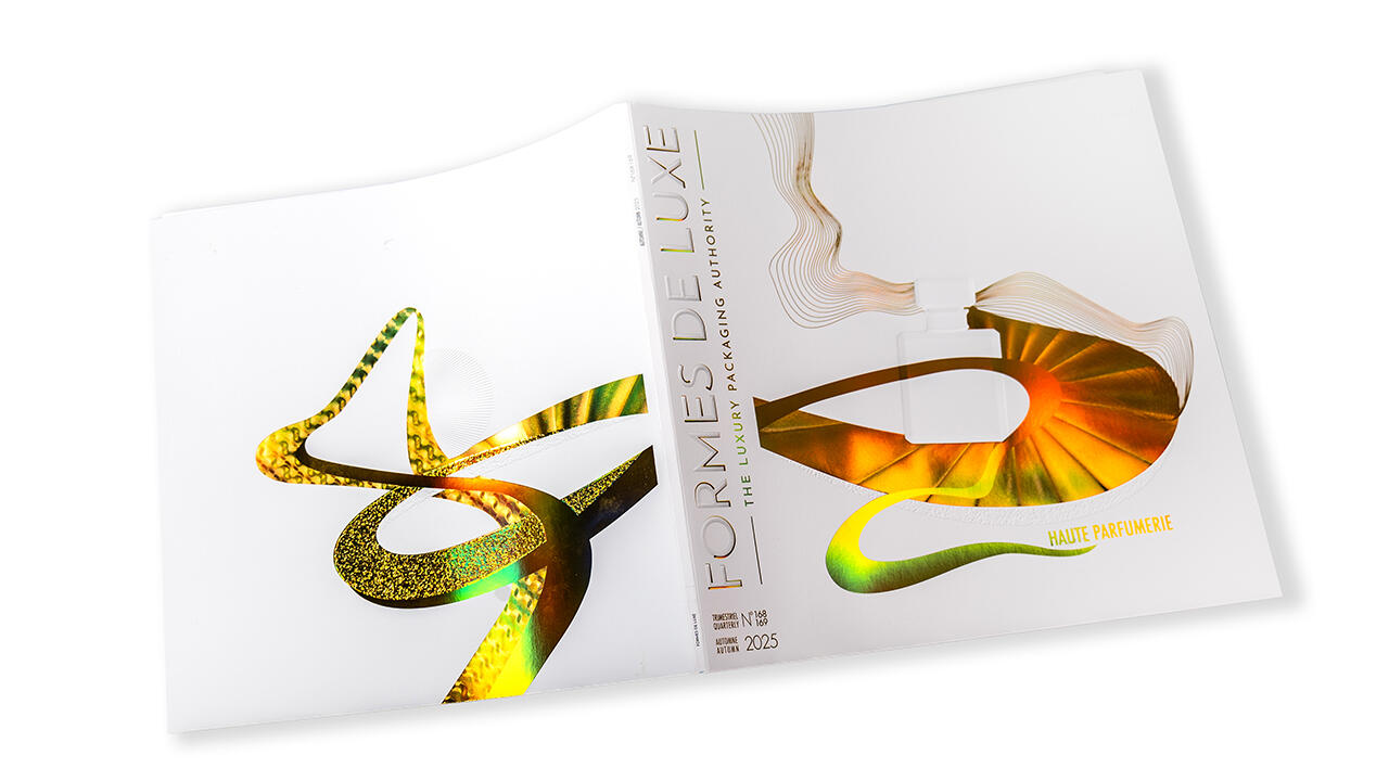
Formes de Luxe stands for exceptional design and packaging that embody pure luxury and express an exquisite sense of lifestyle. Through in-depth reporting on the latest developments in the luxury sector, the magazine also offers valuable insight into the world of high-end brands.
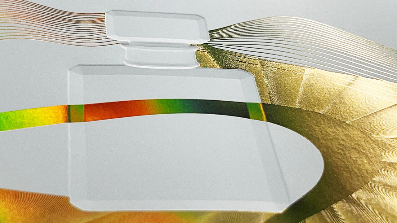
For this year’s issue, the cover captures the essence of Haute Parfumerie – sophisticated, minimalist, and precious. Julia König, Senior Designer at KURZ, translated this theme into the fine art of hot stamping with effortless elegance. Crafted with an exquisite selection of materials from the KURZ portfolio, the result is a cover that feels both exclusive and refined.
Julia König, Senior Design Manager at KURZ
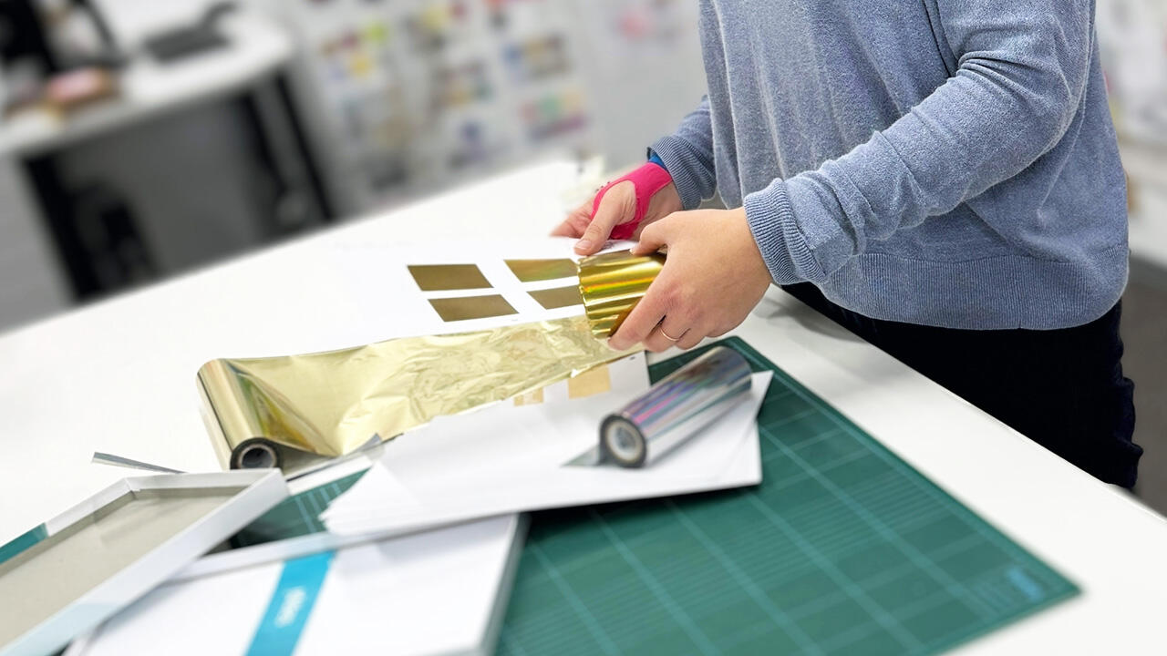
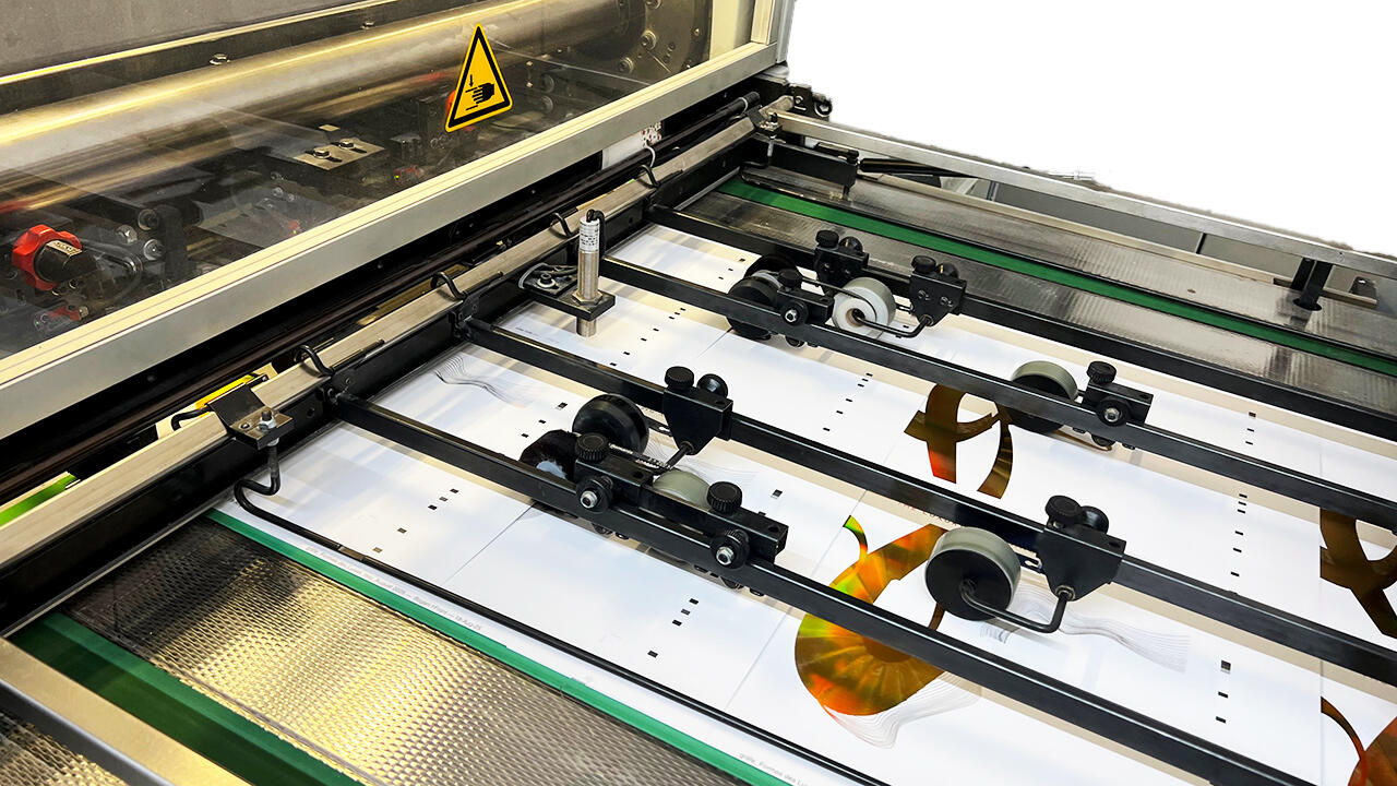
The cover was once again produced by Gräfe Druckveredelung, a renowned specialist in print finishing with more than 90 years of expertise perfecting the art of refinement. It was printed on Sappi Magno Volume 300 g/m², a high-quality matte paper that combines a natural, uncoated feel with exceptional image brilliance. Its fine texture beautifully accentuates the subtle embellishments and intricate embossing details.
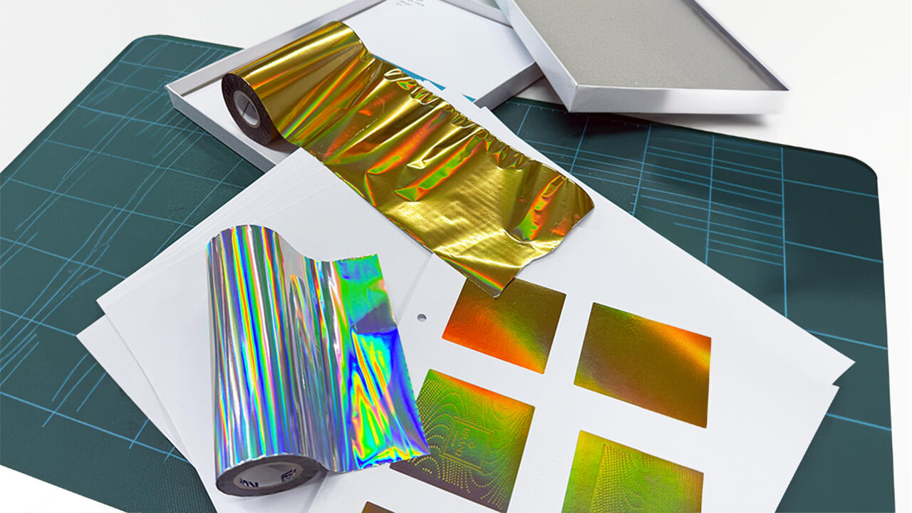
The design features the KURZ trend color LIGHT LINE® Iconic Brass 946060 – an iridescent gold tone that shimmers with a rainbow effect, revealing new facets from every angle. Blind embossing and tactile surface effects on the pure white substrate complete the luxurious interplay of paper, color, and die technology.
Julia König, Senior Design Manager at KURZ
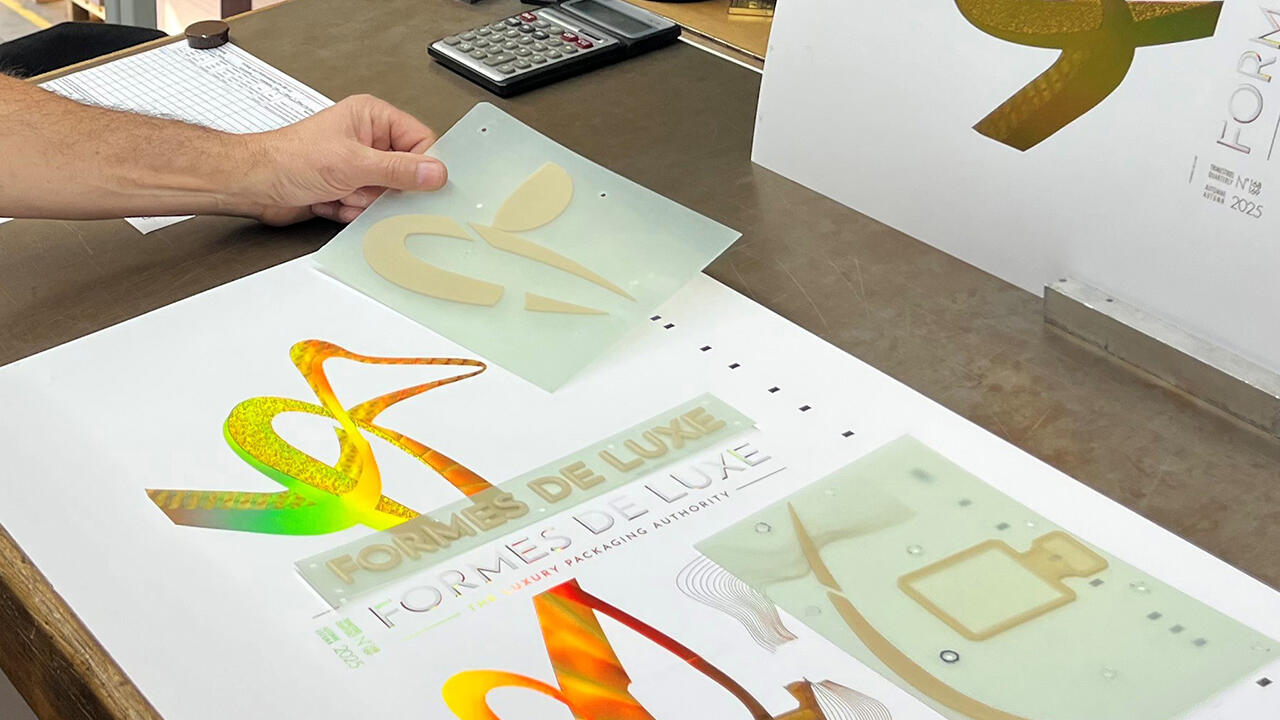
The cover was first printed in four colors, followed by flat embossing with LIGHT LINE® Iconic Brass 946060 on a Gietz Foil Commander. In a final step, all structures – including debossing, embossing, and micro-embossing – were blind imprinted to achieve exceptional depth and dimensional precision. This project was realized with the support of high-precision stamping dies from Hinderer + Mühlich, the stamping tool specialist within the KURZ Group.
Creating the cover for Formes de Luxe required a holistic approach that combined visual sophistication with tactile depth through finishing solutions. This ambitious project was made possible by KURZ's high-quality finishing technology, combined with Hinderer + Mühlich's (H+M) precision embossing tools and Gräfe Druckveredelung's decades of craftsmanship. This unique collaboration resulted in a cover with flawless details and perfect deformation of the substrate, embodying the craftsmanship and technical excellence synonymous with KURZ.
Maxine Martin, Marketing & Sales Development Manager Sappi UK Sales Office Ltd | Sappi Europe
Alissa Demorest, Editorial Director of Formes de Luxe
Aliona Rondeau, Business Development Director of Formes de Luxe
Heike Martetschläger, Marketing & Design Manager at H+M